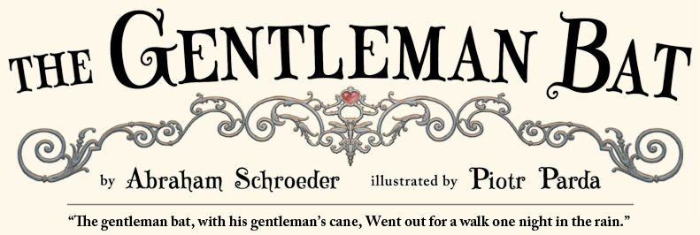
|
The look, style, and feel of The Gentleman Bat evolved over many years. Starting in 2005 or 2006 (or thereabouts, depending on whom you ask and how good their memories are), when Abraham was just beginning to shape the pieces of his poem into cohesive story, Piotr signed on to start illustrating the project. In the early days, when the idea of the book first started taking shape, Piotr and Abraham drew rough sketches on napkins, scrap paper, and sketchbooks, and passed them back and forth across restaurant tables or emailed bits of text and doodles to each other.
The project was a labor of love, and all work on the book was done in snippets of spare time until 2013 when they signed with Ripple Grove Press. The poem and story were constantly shifting and evolving over the years, and the images changed to reflect new plot points and specific details in the text. With all of these factors, there were many false starts, and progress was slow. It can be tempting for artists to pretend that projects are executed in one clean pass, but here is a rare peek into the fun, complicated, and sometimes chaotic creative process.
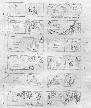
Below is a sampling of some of the many, many sketches and drafts that were done before the book was rendered in final form. The process was not clear and linear, and Piotr and Abraham followed tangents, revisited older ideas, and doodled incessantly, so the images are presented neither consecutively nor orderly. If you think this is messy, it is nothing compared to the jumbled flat files, nested computer folders, hundred-layer Photoshop documents, tangled strings of email conversations, and wrinkled sketchbook pages that have accumulated over the years.
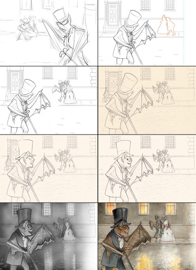
Progression from rough sketch to finished watercolor painting. The bottom left panel shows a value study that Piotr painted in Photoshop and used as visual reference when he was painting the final image using bamboo pen, ink, and watercolor on paper.
|
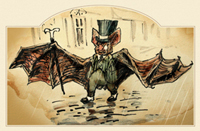
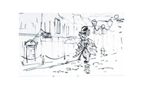
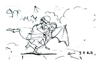
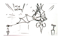
Early Sketches:
Choosing Characters and Styles:
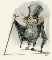
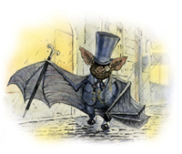
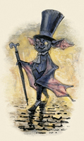
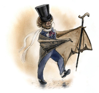
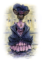
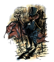
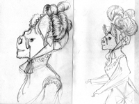
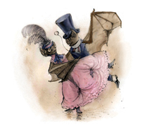
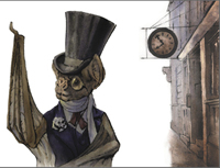
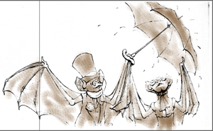
Here are just a sample of Piotr's many early character tests for the book, in no particular order, from around 2006 to 2012, done in pen and ink and watercolor, with a few little computer edits:
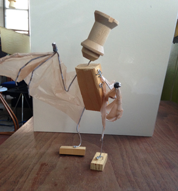
Piotr's homemade anatomy reference for drawing lifelike bat poses:
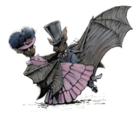
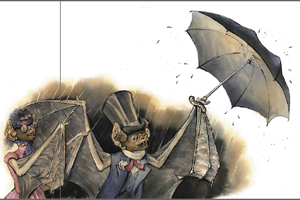
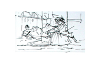
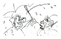
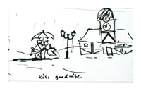
Here are some drafts from around 2010-11, watercolor on paper. As you can see, there were many different ideas about possible aesthetic directions. Because there was no definite timeline to publication, Piotr had the freedom to experiment. However, in the creative artistic process sometimes freedom means that a huge amount of work goes into paintings that are set aside before the final draft. Perhaps some of these beautiful masterpieces will find places in later projects. Stay tuned...
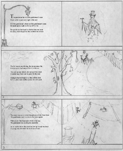
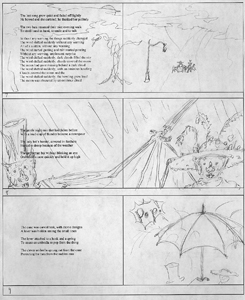
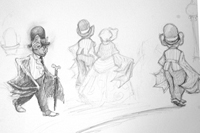
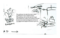
Storyboards:
When considering the book as a whole, it is much easier to make a very rough storyboard of the whole thing to get an idea of page-to-page continuity, rather than rendering each scene in detail. Then, when making big changes there is no need to redraw whole scenes from scratch. Here are some of Piotr's storyboard pages from 2009:
Here are some of Piotr's storyboard pages from 2013, where you can see the compositions starting to resemble the final layout.
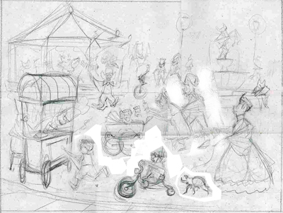
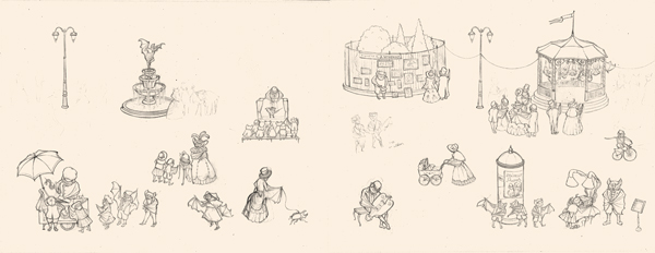
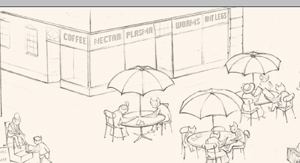
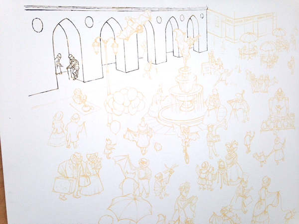
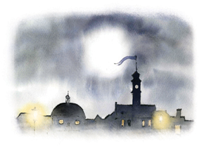
Batford Town Square - Computers in the Illustration Process:
Photoshop and digital drawing tablets were important artistic tools throughout the process, allowing fast manipulation of scanned drawings and paintings, as well as direct digital sketching and painting. Both Piotr and Abraham used Photoshop heavily when exchanging visual ideas and making edits to the book.
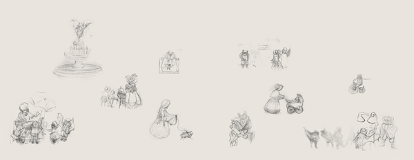
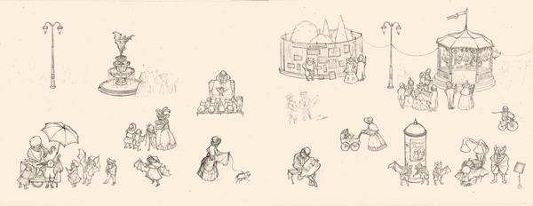
The town square scene is a good example to show how Piotr layered pencil drawings in the computer to build a composition and adjust elements before rendering the final painting in pen, ink, and watercolor. Below is a series of images showing the crowd scene in progress. Using Photoshop to move, flip, and resize the scanned drawings saved Piotr a lot of extra redrawing to finish what was already a complicated scene.
|
An early pencil sketch that Piotr scanned into the computer to tweak some of the details
|

Rough pencil sketch of the final version
|

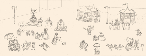
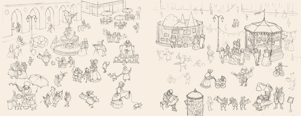
A character reference dropped in, and other details changed
|
More detailed pencil sketches layered in place
|
More details added and rearranged
|
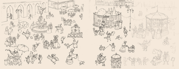
Can you spot the differences?
|
More details added and rearranged
|
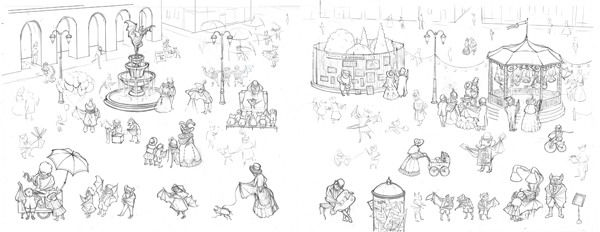
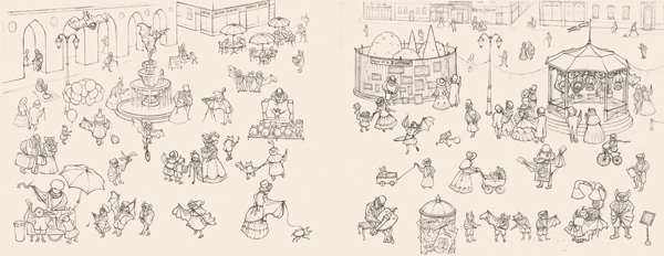
More details added and rearranged
|
A closeup of the restaurant in back
|
More sketches layered in
|
Still more layers added, more tinkering and tweaking
|
Everbody in place? Hold your poses.
|
Once all of the details were set and everything was in the right place, Piotr printed the outlines as a pale reference layer on a piece of watercolor paper larger than the final book. He then inked over the lines with a bamboo pen to give the lines a nice inky texture, and he added flares and details that were not in the original pencil sketches.
|
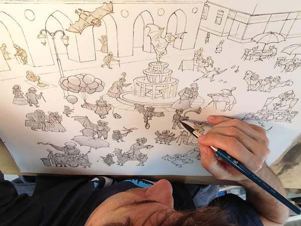
Shading and coloring were done with fine watercolor brushes.
|
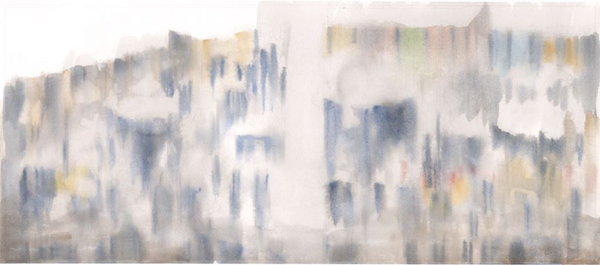
Using another printout of the faint outlines on paper, he painted the shadows and reflections for all
of the elements of the scene.
|
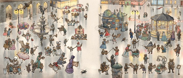
He then scanned the separate paintings and assembled the layers in Photoshop to form one final image.
|
|
|
Most of the scenes in the rest of the book were painted in single layers, but parts of pages with multiple small scenes were painted separately and assembled in the final layout.
|
|
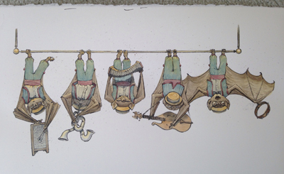
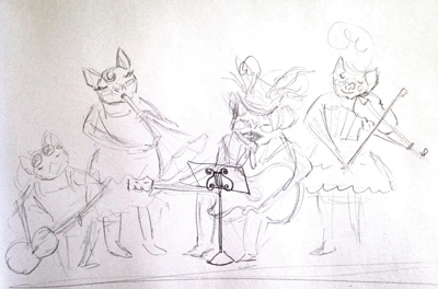
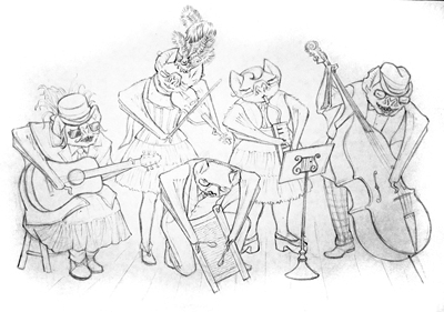
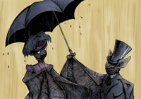
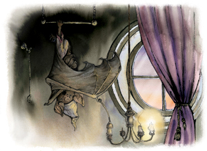
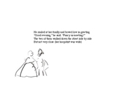
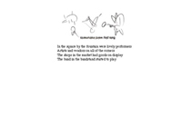
The original sketches for the band, shown below, had the bats seated with their instruments. They also looked a whole lot like bat versions of Boston-based band Walter Sickert & The Army of Broken Toys.
Piotr decided they would be more comfortable playng upside down, and lots of the details changed in the process of finishing the group.
For more of the back stories of images and lots of fun details, check out the Hidden Details page on this site.
|
Cover Design:
|
This section is under construction and will be filled in furthur at a later date.
|
Here is a teaser summary before the cover draft images are sorted and added:
The cover design was a complicated collaboration. Piotr, Abraham, and Ripple Grove Press all had strong opinions, and there were countless edits and revisions tweaking large and small details, as well as many tense moments when it looked like we had an impossible task ahead. All of us were relieved when Piotr clicked all of the final details in place.
After the bulk of the book's interior images were complete, the front coverimage was decided. The team discussed whether to do a full bleed, with the picture extending all the way to the edge of the cover, or to have it inset in a frame, as you see in the final version.
Abraham, being a huge fan of fancy, frilly, showy design, got it into his head to build a frame of decorative ironwork. He started piecing together a frame from late 19th and early 20th century French designs, in Photoshop, which is much cleaner and faster than chopping up old fences.
Piotr then carefully redrew all of the parts in pen and scanned them back into the computer, where we could all work together to fine-tune the layout and scale, including the finished center image and the final text shape and placement.
The back cover text and details were similarly layered and arranged digitally on the background of hand-painted watercolor paper.
|
Cover Text and Typefaces:
The team looked at many different styles of typeface for the cover text. After finding no existing fonts that were quite right, Piotr designed and drew the typefaces for the title and names himself, plus a few other versions that did not make the final cut.
There was some discussion of turning them into usable fonts that could be typed, but that is a whole separate, tedious process.
We'll see if we can track down some of the images of this process for the next update.
|
We plan to update this section in the future, but it may take some time
to get all of the images organized.
Thank you for visiting!
|
|
.jpg)
.jpg)

2.jpg)
.jpg)
 thegentlemanbat.com.